admin

Data exploration with Jupyter Notebook

Programming


Here comes a new platform feature on ALGOGENE to directly work with Jupyter Notebook!


jupyter
Figure 1 - Jupyter Notebook on ALGOGENE

What is Jupyter Notebook?

As its name, Jupyter Notebook is an interactive development environment which allows you to create and share documents that contain live code, equations, narrative text, paragraph, figures, links, etc.

You can perform the following tasks with a Jupyter Notebook:

  • pre-backtest analysis;
  • data transformation;
  • numerical simulation;
  • statistical modeling;
  • data visualization;
  • machine learning;
  • many more ...

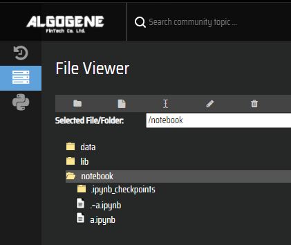
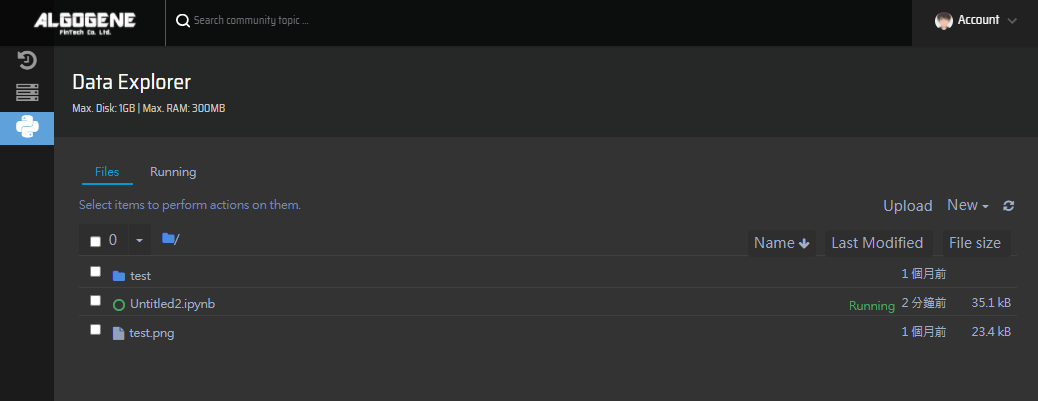
What is Jupyter Dashboard?

In addition to displaying/editing/running notebook documents, the Jupyter Notebook App also has a control panel (called Jupyter Dashboard). It shows local files and allows to open notebook documents and shut down their kernels. It functions like a usual file explorer in a desktop computer for document management.


What is Notebook Kernel?

A notebook kernel is a computational engine that executes the code contained in a Notebook document. When you open a Notebook document, ALGOGENE will automatically assign a partition of computer resource and launch the associated kernel. The kernel performs the computation and produces the results when a notebook is executed. Depending on the type of computations, a kernel process might be shutted down if it consumes significant CPU and RAM beyond the assigned limit.


How can I get start?

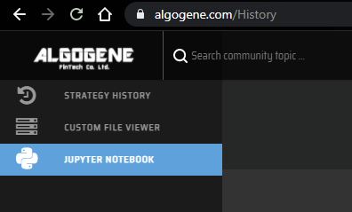
After login ALGOGENE platform,

  • go to [My History] > [Jupyter Notebook]
  • history
  • you will get to Jupyter Dashboard after kernel is initialized
  • you can then create a new notebook document
  • landing

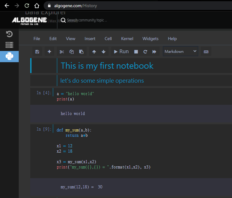
Example 1: basic operation

In a notebook document, there are 2 typical cell elements.

  • markdown cell - to display text
  • code cell - to run live code

We can firstly insert markdown cells as a document heading.

We can also create code cells to run some simple operations.
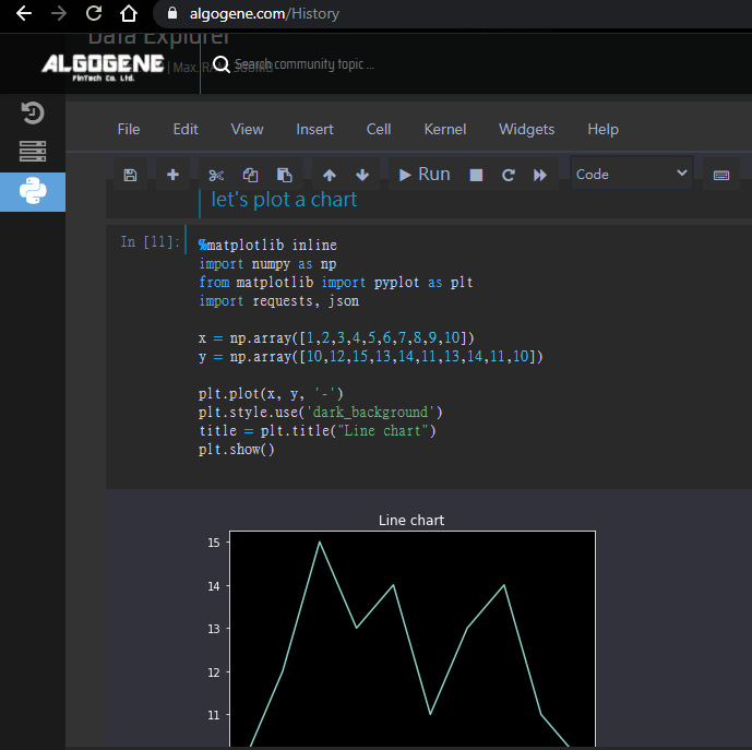
example_markdown

Example 2: charting

Let's continous to create a new code cell. Now, we make up a random dataset and plot a simple x-y chart.

To use "matplotlib" in Jupyter, we need to add %matplotlib inline at the beginning.

 1
 2
 3
 4
 5
 6
 7
 8
 9
10
11
%matplotlib inline
import numpy as np
from matplotlib import pyplot as plt

x = np.array([1,2,3,4,5,6,7,8,9,10])
y = np.array([10,12,15,13,14,11,13,14,11,10])

plt.plot(x,y,'-')
plt.style.use('dark_background')
title = plt.title('Line chart')
plt.show()

example_chart


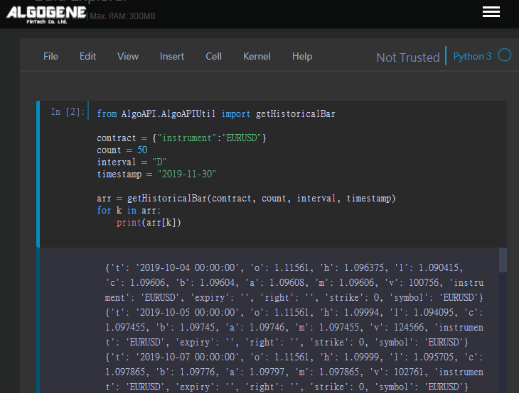
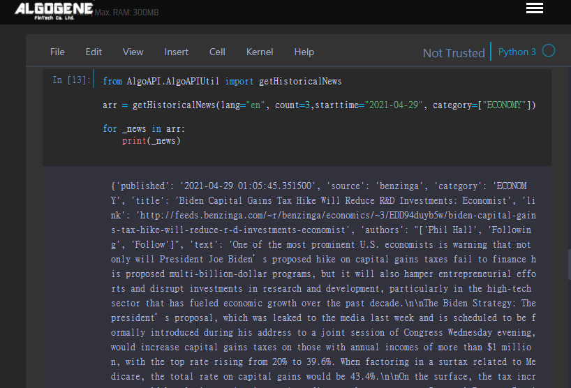
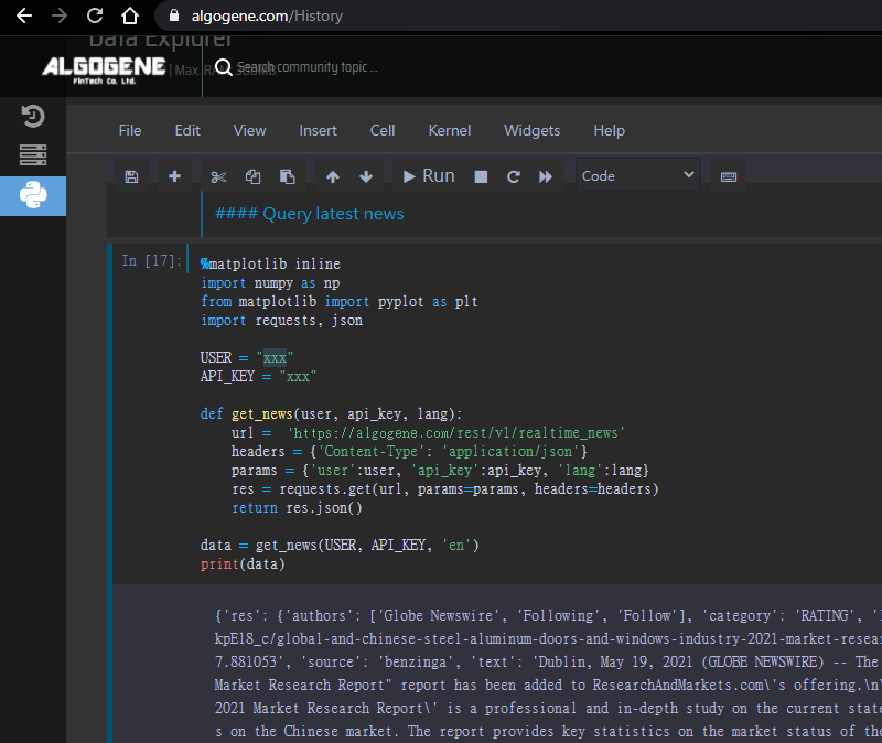
Example 3: data query

Now, let us try query some real-time news from the server.

Referring to the document of ALGOGENE REST API, we need to firstly get our API key which can be obtained from [Settings] > [User Profile]. For more details, please refer to this post.

 1
 2
 3
 4
 5
 6
 7
 8
 9
10
11
12
13
14
15
16
17
%matplotlib inline
import numpy as np
from matplotlib import pyplot as plt
import requests, json

USER = "xxxx"
API_KEY = "xxxx"

def get_news(user, api_key, lang):
    url = "https://algogene.com/rest/v1/realtime_news"
    headers = {'Content-Type':'application/json'}
    params = {'user':user, 'api_key':api_key, 'lang':lang}
    res = requests.get(url, params=params, headers=headers)
    return res.json()

data = get_news(USER, API_KEY, 'en')
print(data)

example_chart


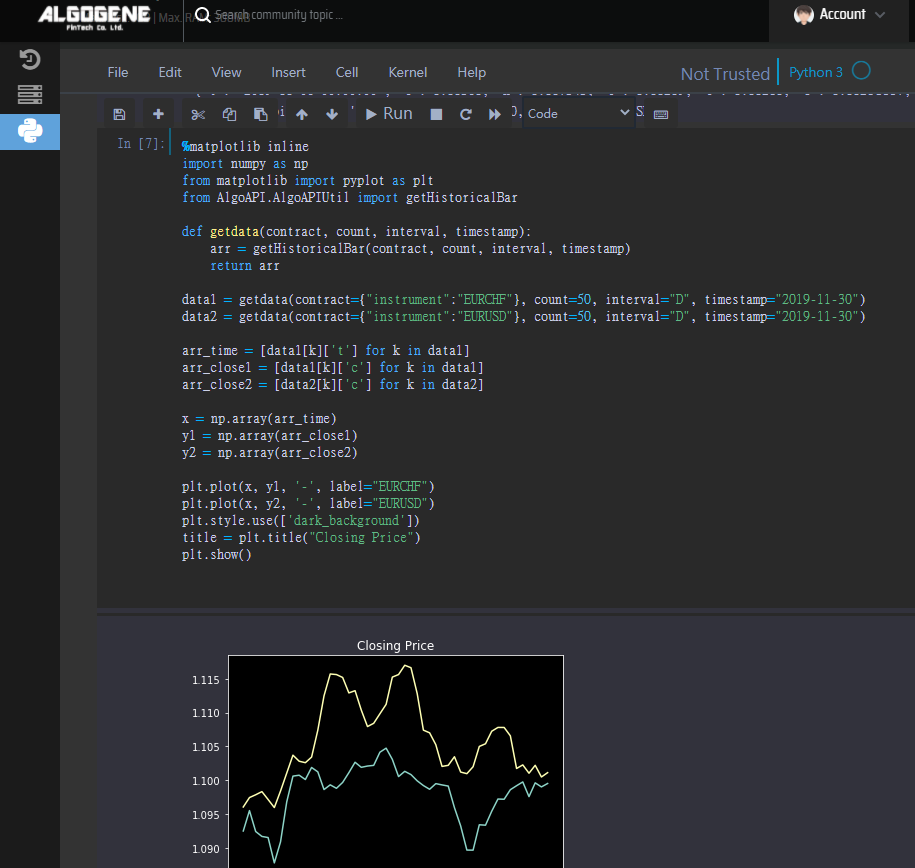
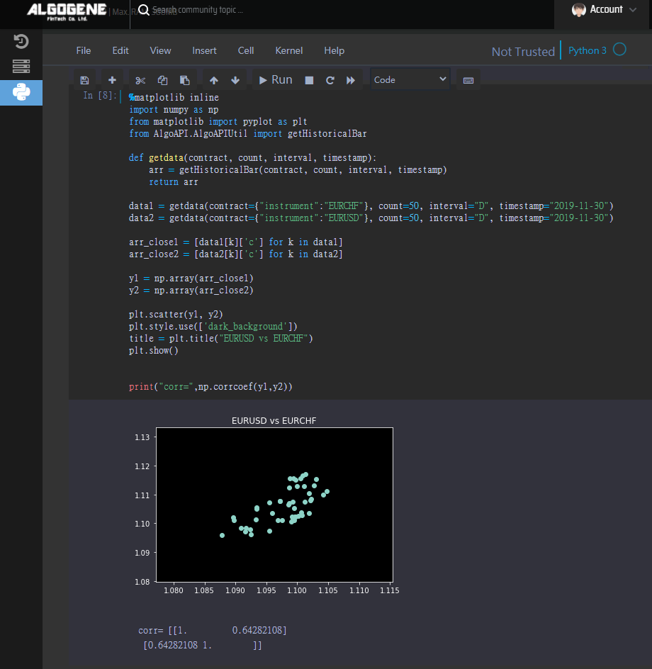
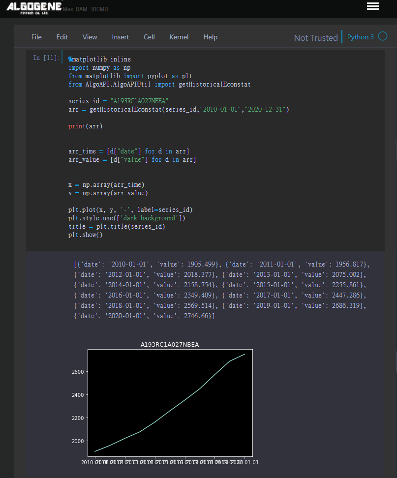
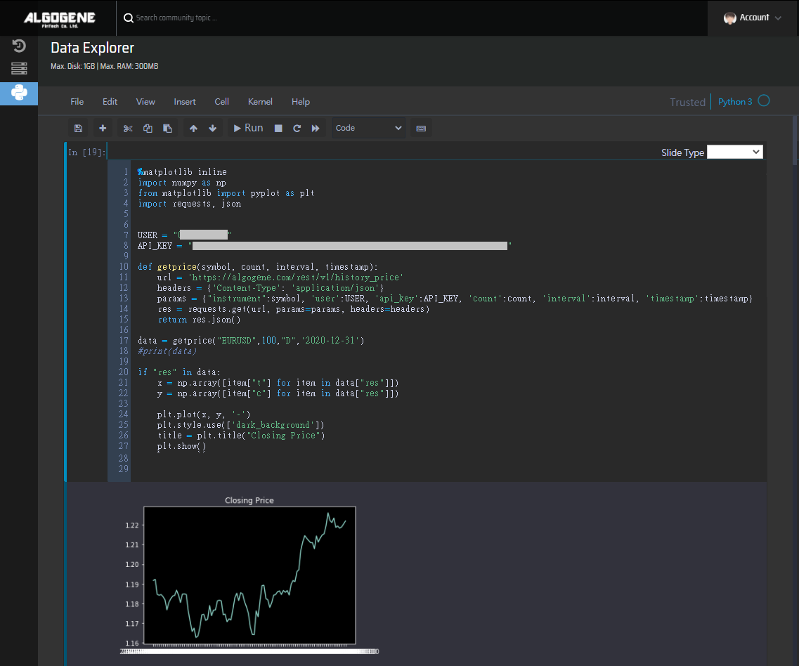
Example 4: visualize market data

This example shows you how to query historial closing price of EURUSD, and then display the data in a line chart.

 1
 2
 3
 4
 5
 6
 7
 8
 9
10
11
12
13
14
15
16
17
18
19
20
21
22
23
24
25
26
27
%matplotlib inline
import numpy as np
from matplotlib import pyplot as plt
import requests, json


USER = "xxxx"
API_KEY = "xxxx"

def getprice(symbol, count, interval, timestamp):
    url = 'https://algogene.com/rest/v1/history_price'
    headers = {'Content-Type': 'application/json'}
    params = {"instrument":symbol, 'user':USER, 'api_key':API_KEY, 'count':count, 'interval':interval, 'timestamp':timestamp}
    res = requests.get(url, params=params, headers=headers)
    return res.json()

data = getprice("EURUSD",100,"D",'2020-12-31')
#print(data)

if "res" in data:
    x = np.array([item["t"] for item in data["res"]])
    y = np.array([item["c"] for item in data["res"]])

    plt.plot(x, y, '-')
    plt.style.use(['dark_background'])    
    title = plt.title("Closing Price")
    plt.show()

example_plot


Now, you learnt what Jupyter Notebook can do. It is time for you to explore the data and build your trading model!


Jeremy
Hi, I have a jupyter notebook developed in my local machine. 
Is it possible to upload to the cloud for further development? 
 
admin
Original Posted by - b'Jeremy': Hi, I have a jupyter notebook developed in my local machine. 
Is it possible to upload to the cloud for further development? 

On ALGOGENE cloud, all notebook documents are held under /notebook

You can upload a local Jupyter checkpoint through [My History] > [File Viewer].


upload


admin

In Jupyter Notebook, we can also query data using the Web API as follows. The usage of market data API can be referred to here.


Example 1: print dataset

 1
 2
 3
 4
 5
 6
 7
 8
 9
10
11
from AlgoAPI.AlgoAPIUtil import getHistoricalBar

contract = {"instrument":"EURUSD"}
count = 50
interval = "D"
timestamp = "2019-11-30"

arr = getHistoricalBar(contract, count, interval, timestamp)
for k in arr:
    print(arr[k])
    

example4


Example 2: multi-series chart

 1
 2
 3
 4
 5
 6
 7
 8
 9
10
11
12
13
14
15
16
17
18
19
20
21
22
23
24
25
%matplotlib inline
import numpy as np
from matplotlib import pyplot as plt
from AlgoAPI.AlgoAPIUtil import getHistoricalBar

def getdata(contract, count, interval, timestamp):
    arr = getHistoricalBar(contract, count, interval, timestamp)
    return arr
    
data1 = getdata(contract={"instrument":"EURCHF"}, count=50, interval="D", timestamp="2019-11-30")
data2 = getdata(contract={"instrument":"EURUSD"}, count=50, interval="D", timestamp="2019-11-30")

arr_time = [data1[k]['t'] for k in data1]
arr_close1 = [data1[k]['c'] for k in data1]
arr_close2 = [data2[k]['c'] for k in data2]

x = np.array(arr_time)
y1 = np.array(arr_close1)
y2 = np.array(arr_close2)

plt.plot(x, y1, '-', label="EURCHF")
plt.plot(x, y2, '-', label="EURUSD")
plt.style.use(['dark_background'])    
title = plt.title("Closing Price")
plt.show()

example5


Example 3: calculate correlation

 1
 2
 3
 4
 5
 6
 7
 8
 9
10
11
12
13
14
15
16
17
18
19
20
21
22
23
24
25
%matplotlib inline
import numpy as np
from matplotlib import pyplot as plt
from AlgoAPI.AlgoAPIUtil import getHistoricalBar

def getdata(contract, count, interval, timestamp):
    arr = getHistoricalBar(contract, count, interval, timestamp)
    return arr
    
data1 = getdata(contract={"instrument":"EURCHF"}, count=50, interval="D", timestamp="2019-11-30")
data2 = getdata(contract={"instrument":"EURUSD"}, count=50, interval="D", timestamp="2019-11-30")

arr_close1 = [data1[k]['c'] for k in data1]
arr_close2 = [data2[k]['c'] for k in data2]

y1 = np.array(arr_close1)
y2 = np.array(arr_close2)

plt.scatter(y1, y2)
plt.style.use(['dark_background'])    
title = plt.title("EURUSD vs EURCHF")
plt.show()


print("corr=",np.corrcoef(y1,y2))

example6
 
admin

The usage of economic data API can be referred to here.


Example

 1
 2
 3
 4
 5
 6
 7
 8
 9
10
11
12
13
14
15
16
17
18
19
20
21
22
%matplotlib inline
import numpy as np
from matplotlib import pyplot as plt
from AlgoAPI.AlgoAPIUtil import getHistoricalEconstat

series_id = "A193RC1A027NBEA"
arr = getHistoricalEconstat(series_id,"2010-01-01","2020-12-31")

print(arr)


arr_time = [d["date"] for d in arr]
arr_value = [d["value"] for d in arr]


x = np.array(arr_time)
y = np.array(arr_value)

plt.plot(x, y, '-', label=series_id)
plt.style.use(['dark_background'])    
title = plt.title(series_id)
plt.show()

example7


admin

The usage of news data API can be referred to here.


Example

1
2
3
4
5
6
from AlgoAPI.AlgoAPIUtil import getHistoricalNews

arr = getHistoricalNews(lang="en", count=3,starttime="2021-04-29", category=["ECONOMY"])

for _news in arr:
    print(_news)

example8


admin

The usage of on-chain data API can be referred to here.


Example

 1
 2
 3
 4
 5
 6
 7
 8
 9
10
11
12
13
14
15
16
17
18
19
20
21
22
%matplotlib inline
import numpy as np
from matplotlib import pyplot as plt
from AlgoAPI.AlgoAPIUtil import getChain_AddressNew

asset = "BTC"
arr = getChain_AddressNew(asset,"2020-01-01","2020-12-31")

print(arr)


arr_time = [d["t"] for d in arr]
arr_value = [d["v"] for d in arr]


x = np.array(arr_time)
y = np.array(arr_value)

plt.plot(x, y, '-', label=asset)
plt.style.use(['dark_background'])    
title = plt.title(asset)
plt.show()

example9


Similarly, we can replace "getChain_AddressNew" with other available on-chain functions :

  • getChain_AddressNew
  • getChain_AddressReceiver
  • getChain_AddressSender
  • getChain_AddressTotal
  • getChain_BlockInterval
  • getChain_BlockMined
  • getChain_BlockSize
  • getChain_FeeMiner
  • getChain_GasUsed
  • getChain_HashRate
  • getChain_IndicatorSOPR
  • getChain_MarketCap
  • getChain_Supply
  • getChain_TransactRate